Vidigami
About Vidigami
Vidigami web app 4.0 was an effort to make a photo management system that is more sensitive to different types of users (Parents, students, and staff) and trying to address each of their needs when uploading, archiving, and sharing in Vidigami
Vidigami Web App 4.0 - 4.3
Problem:
The next step for the Vidigami app was to create components that will make a more robust platform that does not require Vidigami’s customer support for the schools to edit user information. I also Designed:
Video embedding to Vidigami
Creating showcase widgets to share in 3rd party websites
Incorporating single sign from school platforms like Finalsite and Blackbaud websites to Vidigami
Feeds and Notification system
Self Serve System
In addition, we also wanted to make the platform more flexible to accommodate the needs of each community by designing a way to customize user roles and permissions so that will give admins control over how their community uses the platform.
Process:
Embedded in the Development team, I was taking part in the ideation phase in all-new features
Identified pain points from both our customers and our support team through documenting findings in user tests and feedback documentation.
Defined the user stories, requirements, and scoped the project with fellow stakeholders.
Created wireframes and high-fidelity mockups for user testing, Development, and QA.
Webapp Features
Vidigami Mobile App Version 2.0
Problem:
With vidigami parents, students, and school staff can view and share photos of their everyday school life so that they can engage in the school experience, however, Vidigami use to be a web app solution that was designed to be used on a desktop.
This made it harder for the community to be able to contribute when they are in the heat of the moment. By providing our communities with a mobile app, they can share their most important moments easily.
The previous Vidigami prototype was based on the previous Vidigami 3.0 Web app and with the release of the new 4.0 Web-app, performance and Usability problems were identified:
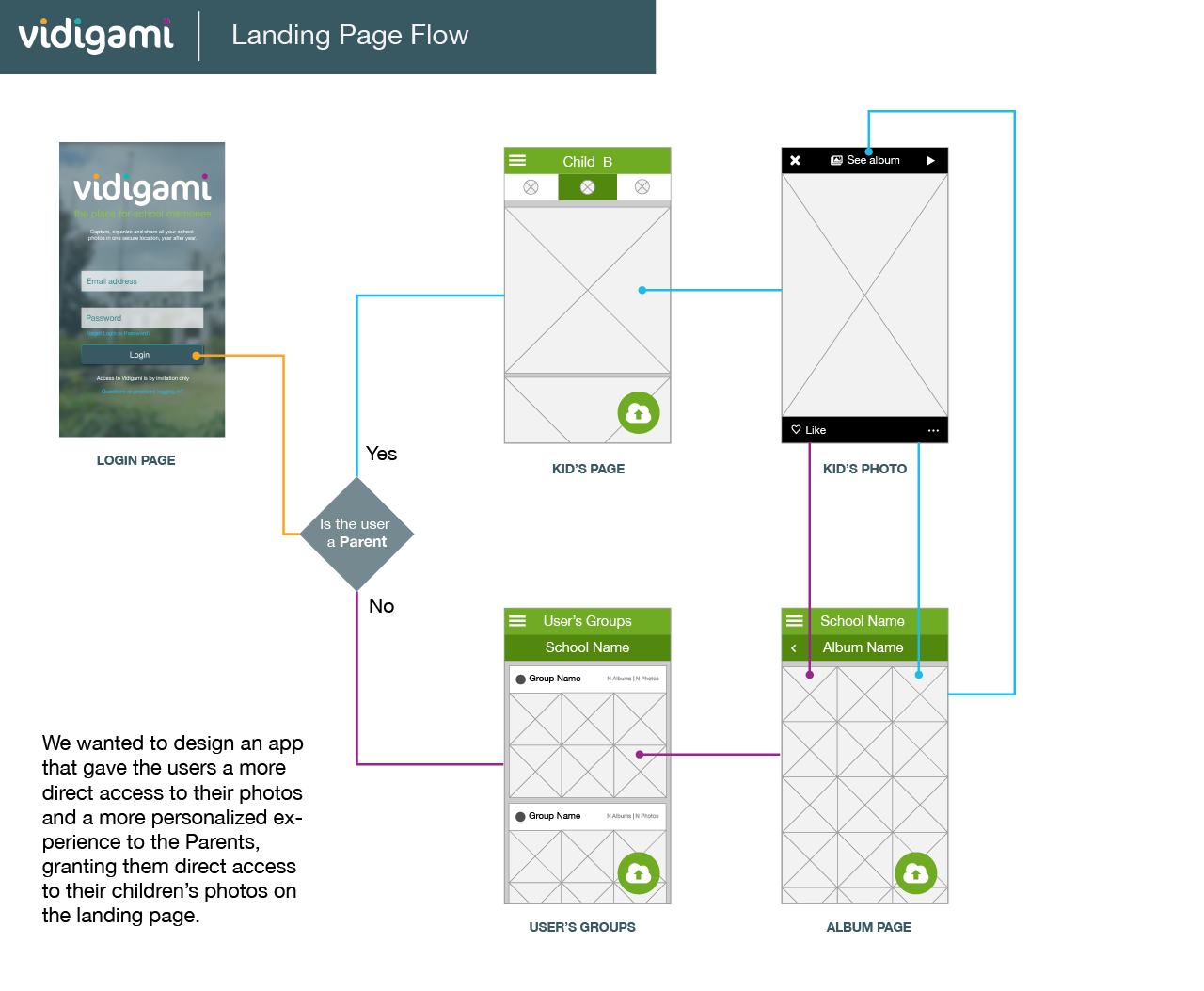
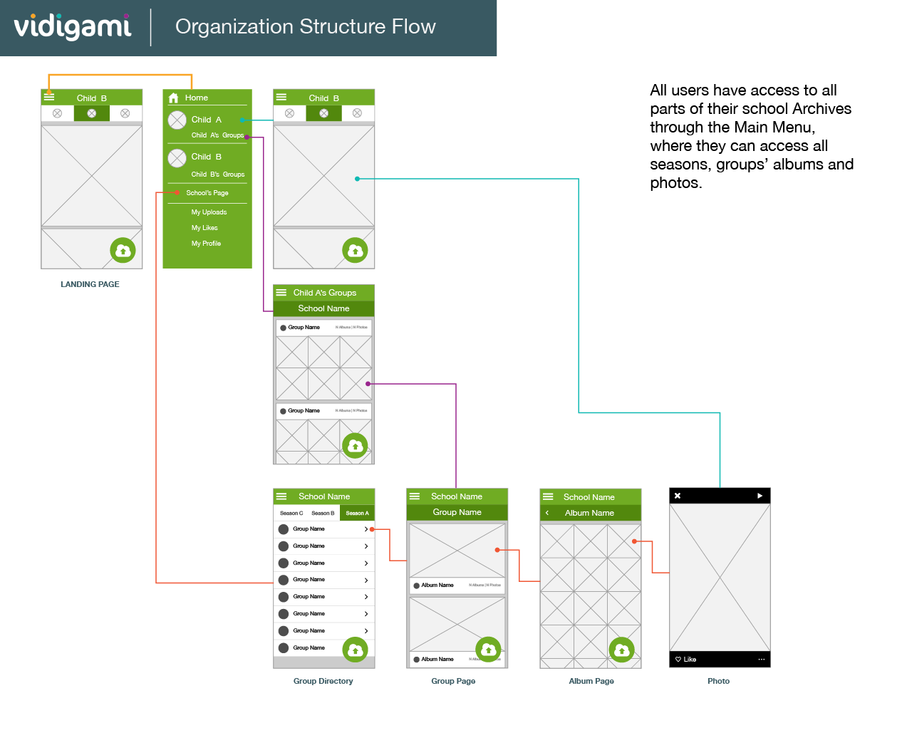
Users did not have direct and easy access to new content as they had to go through all the organizational structures (Organization (school) / Groups / Albums) in order to see their photos.
With the New Web-app, there were a number of new features that we wanted to translate to the Mobile app, Like Face Tagging.
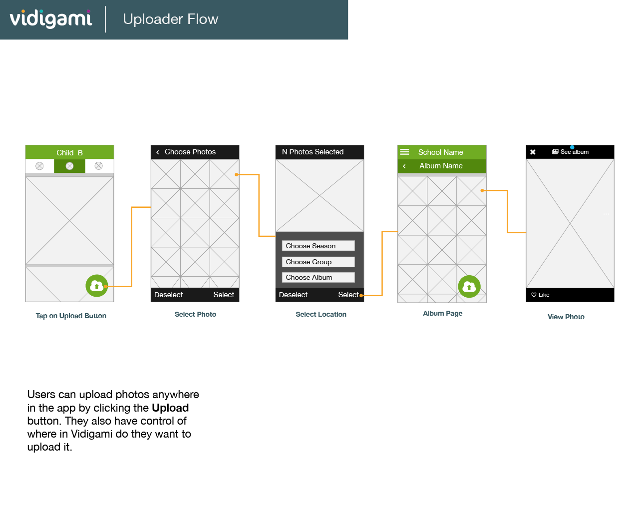
We wanted to have an interface that was recognizable and easy to use and focused On the go experience of taking a photo and uploading it to Vidigami any time, anywhere.
Process:
Identifying User pain points and Performance problems that the last App had.
Writing the user stories, requirements, and setting up the scope of the first version of the app.
Creating user flows, wireframes and verifying our assumptions by making user test.
Creating a High fidelity mockup for final testing and QA.
User Flows


